

MiCare: Malaysia Health Insurance Industry and User Experience
In Malaysia, the health insurance sector's digital transformation now includes user experience as a core component. As technology continues to evolve, health insurance companies are recognizing the importance of enhancing customer experience to improve patient outcomes, increase satisfaction, and reduce costs. This case study will go further into the UX trend in the health insurance market as it examines the significance of UX and digital transformation in Malaysia's health insurance sector.
[ UX Research ]
UX Trend in Health Insurance Industry
According to a study conducted by Accenture, 82% of health insurance customers in Malaysia have high expectations for digital services. These customers expect the same level of user-friendliness, convenience, and personalisation that digital-focused companies provide. Therefore, it is essential for health insurance companies to offer easy-to-use digital services that allow customers to manage their health and insurance needs more efficiently. Those companies that can provide such services are likely to have a competitive advantage.
In this case study, we will be exploring the transformation of MiCare, a healthcare app developed by Zuellig Pharma, to provide users with a more seamless and user-friendly experience. While MiCare is a prominent player in the employee health insurance app market in Malaysia, its current user experience leaves much to be desired. The goal is to improve the app's usability and explore how users can better access and utilise the features they need to manage their health insurance needs.
[ The Challenge ]
[ The Pain Points ]
Visual Identity & UI
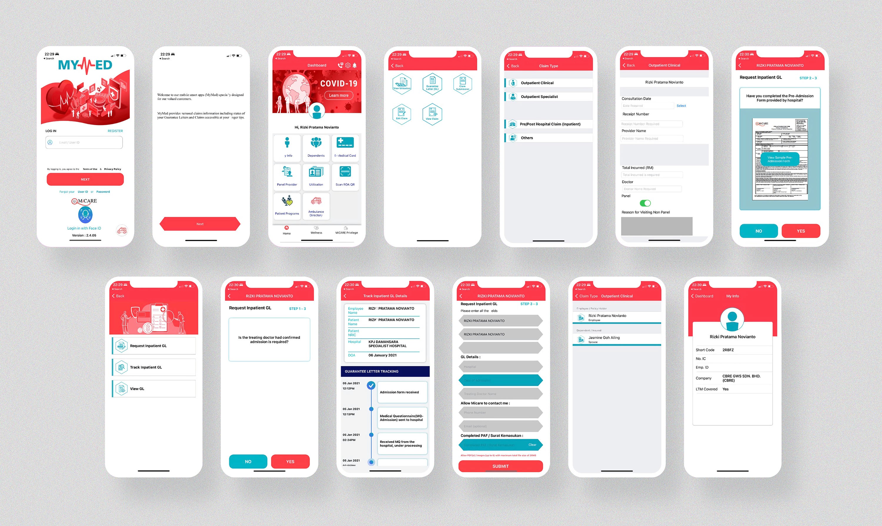
Users find the current visual identity and UI of the MiCare app confusing and difficult to navigate.
Lack of consistency in the design elements and color scheme of the app, leading to confusion and difficulty in understanding the app's features and functionality.
Users find it challenging to locate critical information due to poor information architecture and non-intuitive design elements.
Personalised Experience
Lack of relevant content and personalisation options based on users' health insurance needs and preferences, leading to an impersonal and generic user experience.
Streamlined Request Letter and Claim Process
Users find the request letter and claim process within the MiCare app lengthy and complicated, leading to frustration and user drop-off.
Users struggle with the input forms as they are wonky and lack of clear indications.
Visibility and Transparency
Users find it challenging to track their claim and request letter status within the app, leading to a lack of transparency in the process.
[ The Goals ]
Objectives
Asses and improve the current visual identity and user interface to create better navigation system and build more trust towards the brand.
Deliver a personalised experience for customers within the MiCare app that is tailored to their individual health insurance needs and preferences.
Streamline the claim and request letter process within the MiCare app to make it more efficient and less time-consuming for customers, at the same time improving the accuracy and completeness of the processes to reduce errors and avoid rework
Enhance the visibility and transparency of the claims and request process to improve communication and build trust with the users.
Integrate additional digital health insurance and lifestyle services within the MiCare app to provide a more comprehensive and convenient experience.
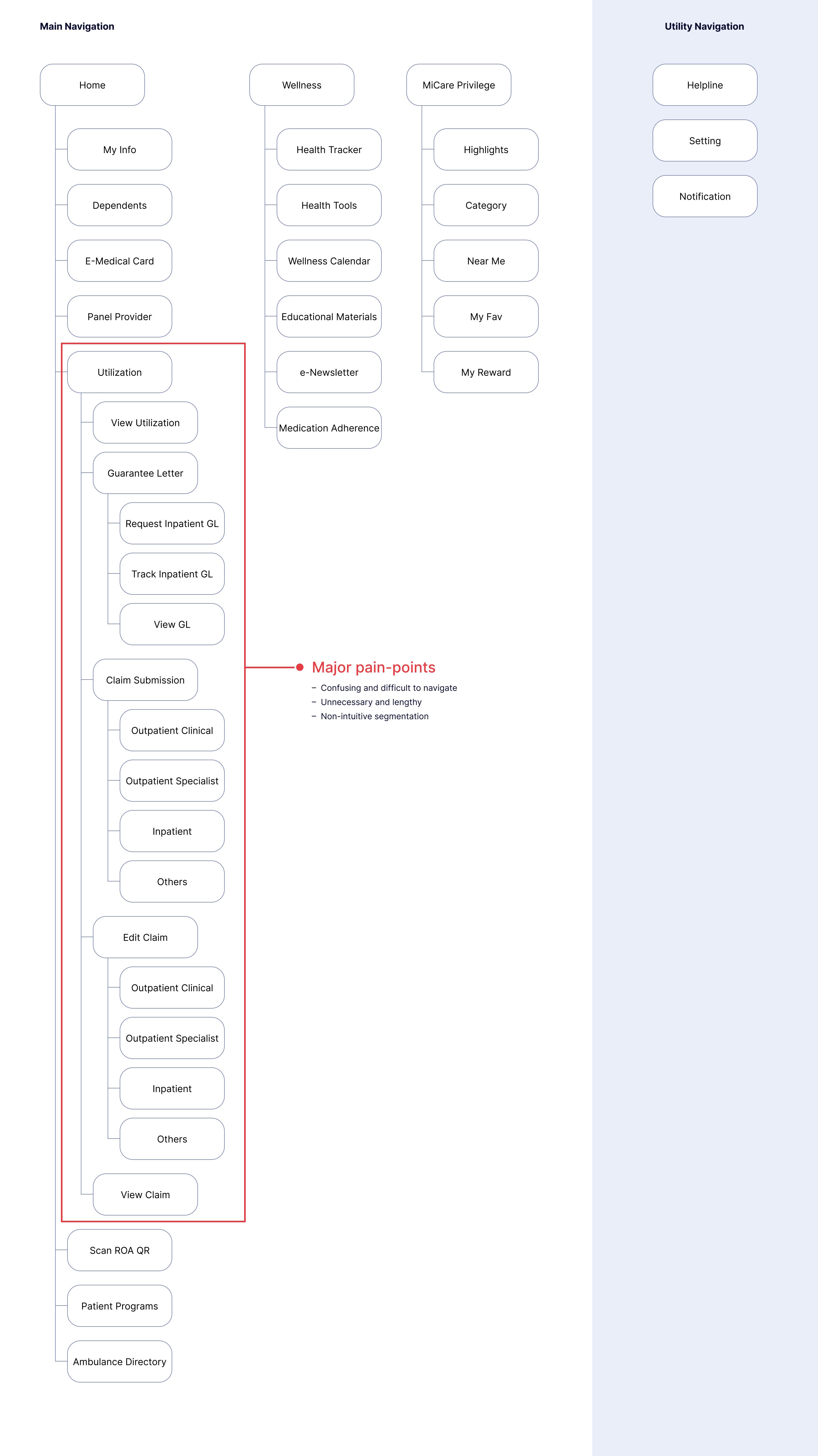
As-is visual identity
[ Solution ]
Brand uplift
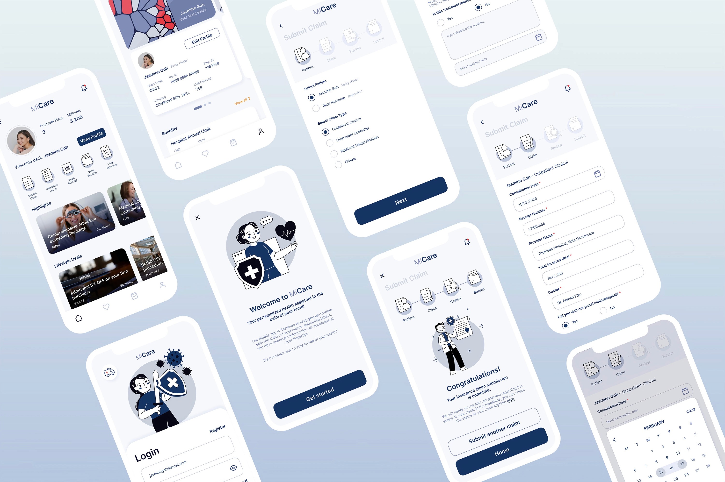
I recognise that MiCare needs to update its visual identity and branding in order to enhance the overall user experience. The goal is to create a more sophisticated and sleek look, while still maintaining a minimalist approach. This includes updating the illustration style to be more consistent and meaningful, providing users with a more engaging and memorable experience.
In selecting a color theme for the app, I believe that dark blue is a much suitable choice than red for a health insurance app. Dark blue is often associated with stability, trust, and calmness, which aligns well with the health insurance industry. It is a color that is often used in hospitals and healthcare facilities, and has a calming effect on patients. In contrast, red can be associated with danger and urgency, which can create an unnecessary sense of panic for users within the app. By selecting a calming and reassuring color theme, user can create a more positive and comfortable experience for users within MiCare.
To-be visual identity
[ Solution ]
Simplify information architecture
In order to simplify the information architecture and make it more intuitive and user-friendly, I have discovered couple of crucial solutions. One approach is to reduce the number of steps required for users to access key features like submitting claims, request for guarantee letters, and viewing benefits and activities. By streamlining the process, users can complete tasks more quickly and easily, lowering frustration and improving user satisfaction.
As-is information architecture
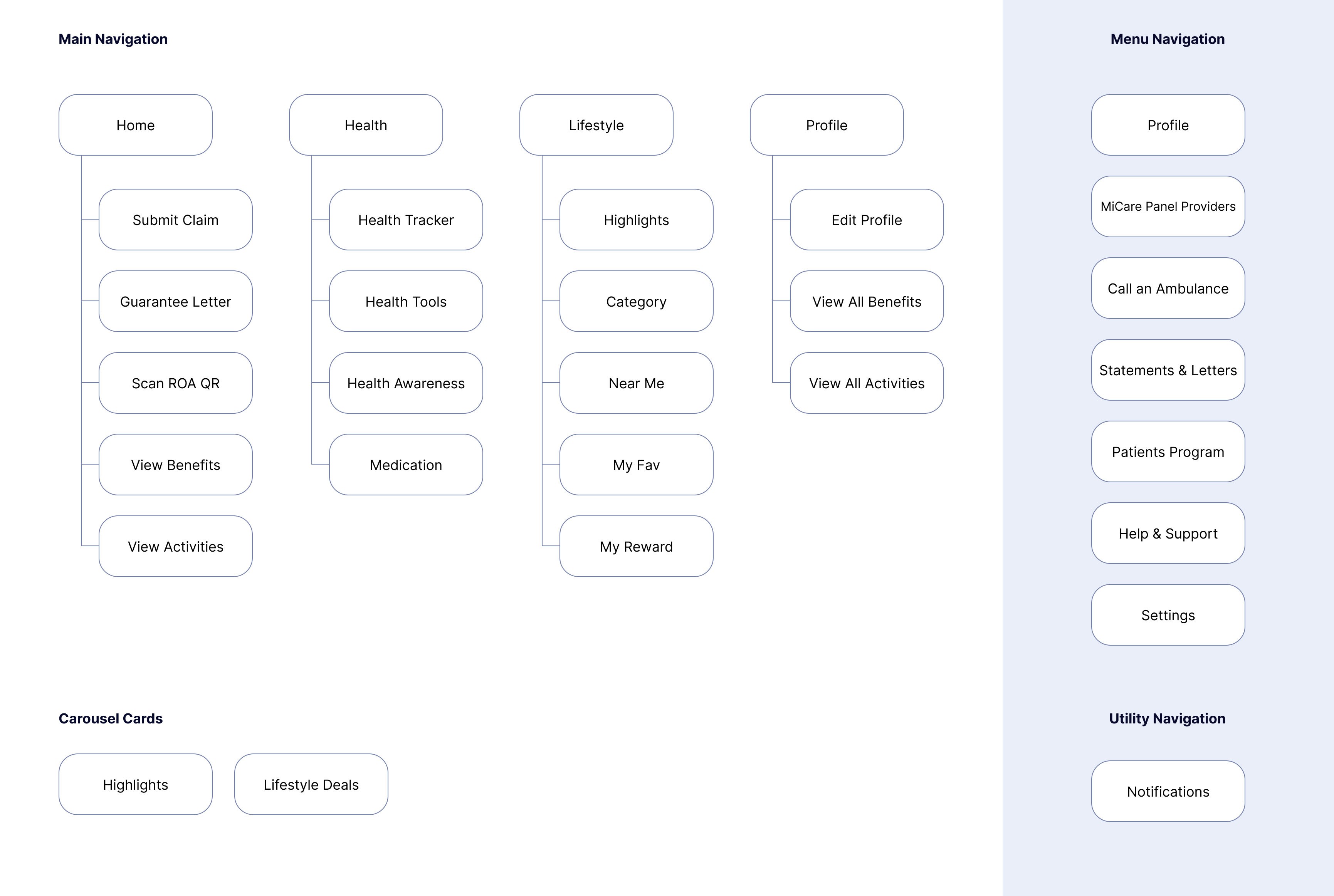
To-be information architecture
[ Solution ]
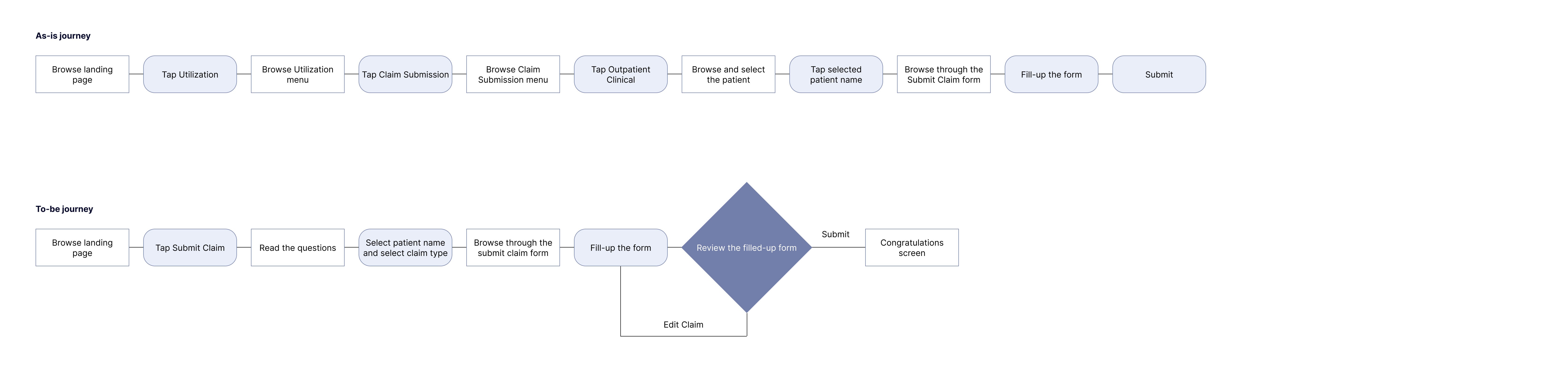
Streamline request guarantee letter process
To streamline the process of requesting a guarantee letter, users can now access it directly from the home page, eliminating the need for a separate page. The new process consists of only four key steps, each clearly indicated by a tracker at the top of the screen. This reduces the number of required steps by 45% without sacrificing any critical information. Additionally, the third step, "Review," provides an opportunity for users to confirm and edit the filled-out form, ensuring greater accuracy in the process.
Request guarantee letter flow chart

[ Solution ]
Streamline submit claim process
Users can now access the submit claim directly from the home page, eliminating the need for a separate page. The new submit claim process also consists of four key steps, each clearly indicated by a tracker at the top of the screen. This reduces the number of required steps by 30% without sacrificing any critical information. The third step, "Review," allows users to confirm and edit their form for greater accuracy. Plus, an improved date picker makes selecting dates even easier.
Submit claim flow chart
[ Solution ]
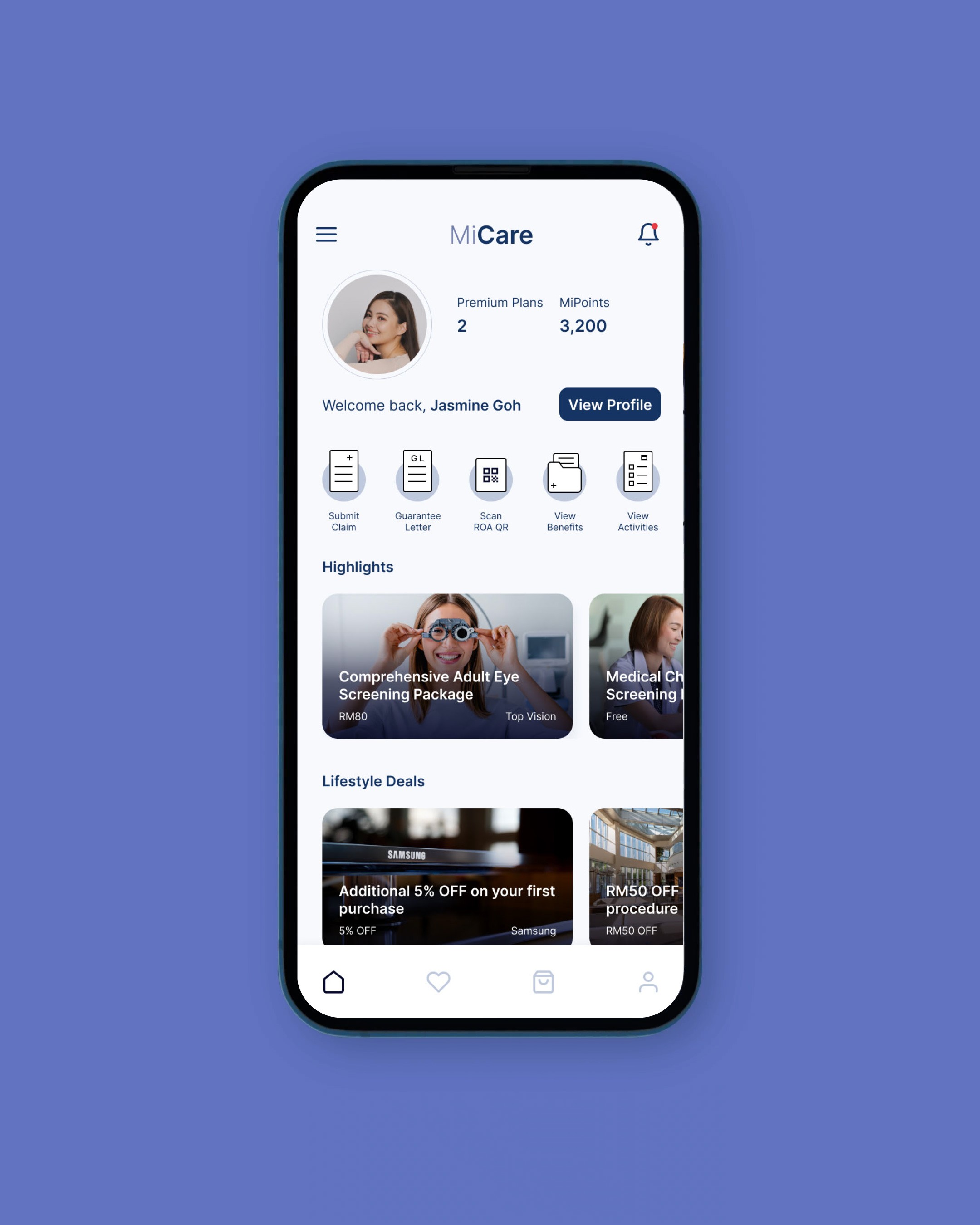
Repurpose profile page
The new profile page allows users to access benefits and activities directly from it, eliminating the need to navigate through the utilisation page, which has now been removed. Additionally, users can access dependent details by simply dragging the e-medical card, making it more intuitive and efficient.
By consolidating all essential information within the profile page, users can easily access the information they need without having to navigate through multiple pages, resulting in a more seamless user experience.
[ Solution ]
Increase transparency
Clear indications and status of claims and request letters are now displayed in the Activities section, with each card showing one of three status updates: "Rejected," "In Process," or "Claimed/Issued." The color-coding of these statuses ensures better visibility for users. Additionally, users can easily access detailed information for each activity by expanding the card. For request letters, a tracker has been added that displays the status from admission form received to letter issued, providing more transparency throughout the process.
This feature is now easily accessible through both the profile page and the congratulations screen that appears after completing the "submit claim" or "request guarantee letter" process. This not only increases the visibility of the user's claim and request status but also enhances transparency, providing users with more information and improving their trust in the app.
[ Solution ]
Improve the navigation
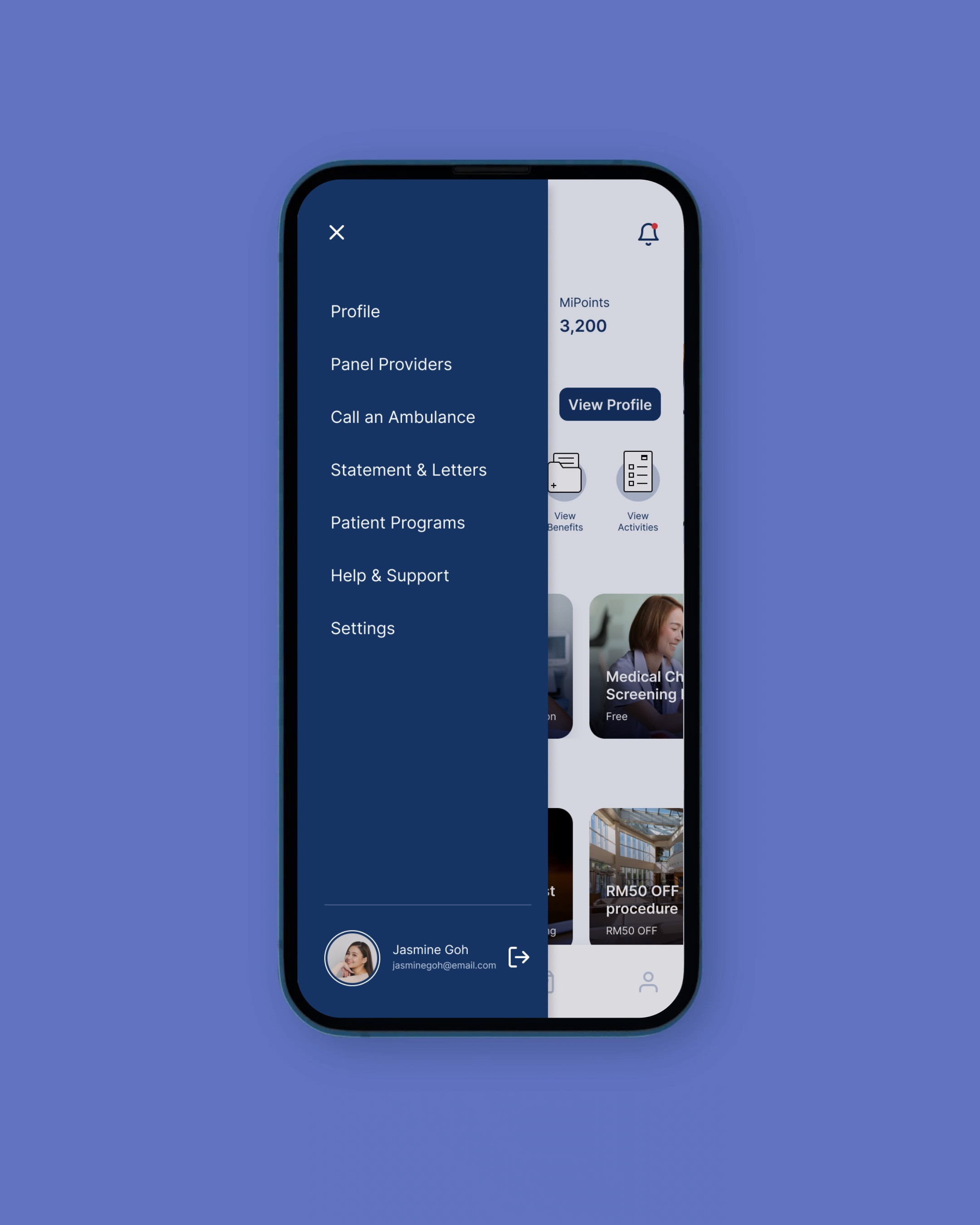
Reduce the utility navigation to just notifications, creating a cleaner and more focused experience for users. At the same time adding a menu navigation represented by the burger icon, which will include features that may not necessarily be displayed on the home page, such as panel providers, statements and letters, patient programs, help and support, and settings. This will make it easier for users to access additional features and information within the app, without cluttering the home page with too many features.
[ Solution ]
Restructure the landing page
The new landing page of MiCare emphasises lifestyle and deals to align with the current trend in the health insurance industry. Consumers increasingly seek comprehensive wellness platforms that support their overall health and well-being, rather than simply addressing medical needs. By positioning itself not only as a healthcare-focused app but also a lifestyle app, MiCare can attract a wider range of users and promote ongoing engagement. This trend is supported by a survey conducted by Accenture, which found that 76% of consumers believe technology can improve their health and well-being, while 60% are willing to share lifestyle information for personalised recommendations.
[ Future State ]
YuLife
It is important to note that this case study only represents the first iteration of MiCare's redesign. To achieve a complete transformation of the app, further usability testing and other UX exercises are necessary.
One key area of focus will be on increasing user engagement through rewards and gamification systems. These features have been shown to increase user engagement and motivation, ultimately leading to better health outcomes.
According to a survey conducted by UnitedHealthcare, 79% of respondents said that a rewards program would motivate them to be more active and healthy. Furthermore, research has shown that gamification can increase engagement and retention rates by up to 40%.
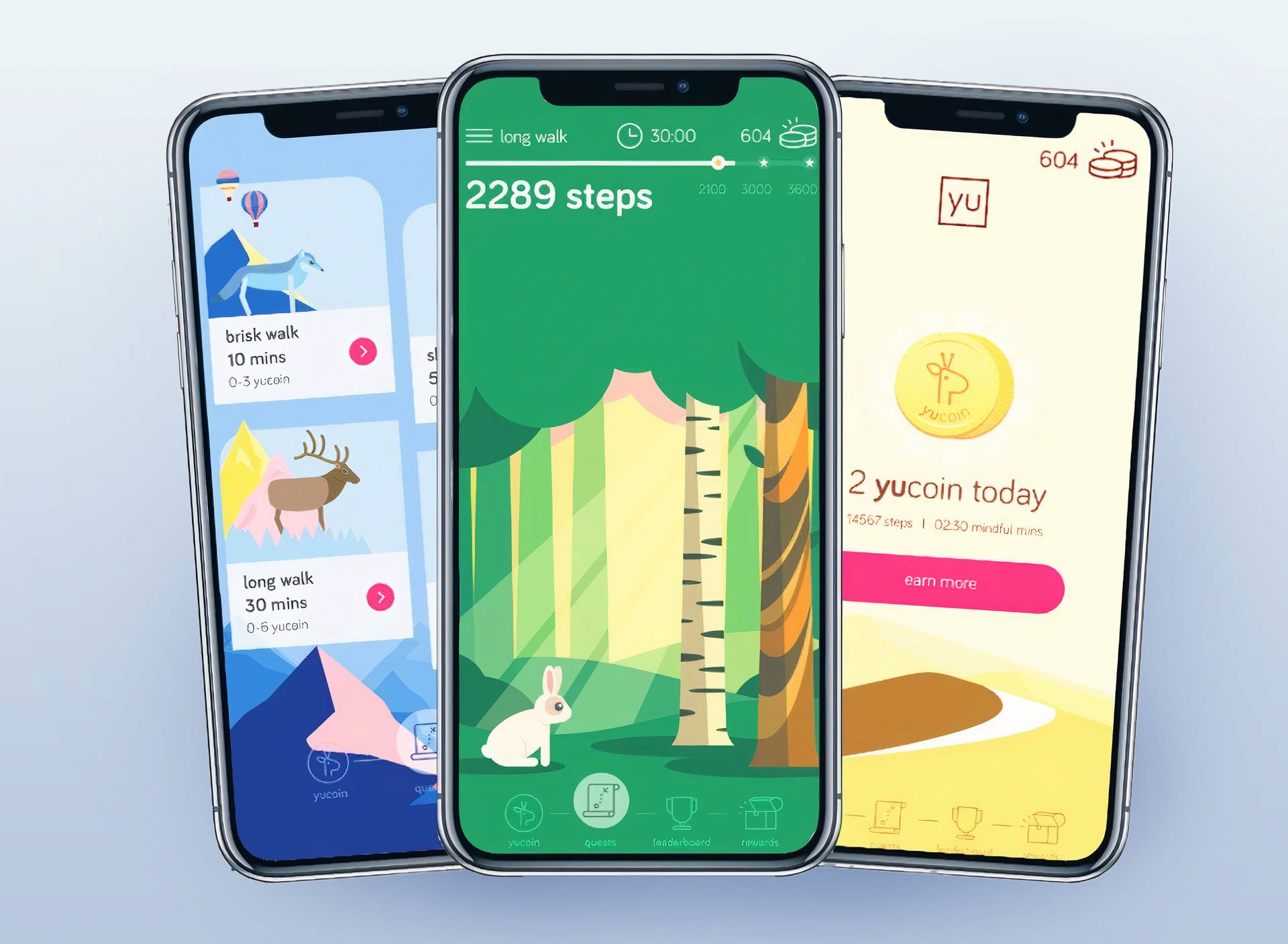
One app that has successfully implemented these features is YuLife. This insurance app has transformed the traditional focus on death and illness into a platform that inspires life and rewards living. By offering rewards for healthy behaviors such as exercise and meditation, YuLife has increased engagement and helped users live healthier lives.
MiCare can draw on these insights to develop similar rewards and gamification systems that encourage users to take an active role in their health and well-being. By doing so, MiCare can position itself as a leader in the healthcare industry, offering a comprehensive platform that not only addresses medical needs but also promotes overall wellness and healthy lifestyles.
[ References ]
"National e-Health Strategic Plan 2016-2020." Ministry of Health Malaysia.
"Malaysia Health Insurance Customer Experience Index 2020." Accenture.
"The Business Impact of Customer Experience, 2020." Forrester.
"AIA Malaysia introduces a new wellness programme." Insurance Business Asia.
"MiCare partners with DoctorOnCall to offer virtual medical consultation." The Star Online.
"Great Eastern introduces new mobile app." Insurance Business Asia.
"Prudential Malaysia unveils PRUWorks Plus." Insurance Business Asia.
