Oil & Gas: Financial Insights Generator
[ The Challenge ]
[ The Goal ]
[ UX Research ]
As-is process

[ The Pain Points ]
Overlapping, duplication of tools, located in different toolboxes
Manual Collection, Consolidation, Transformation
Data accuracy and timeliness is hampered by hard and soft barriers
[ Solution ]
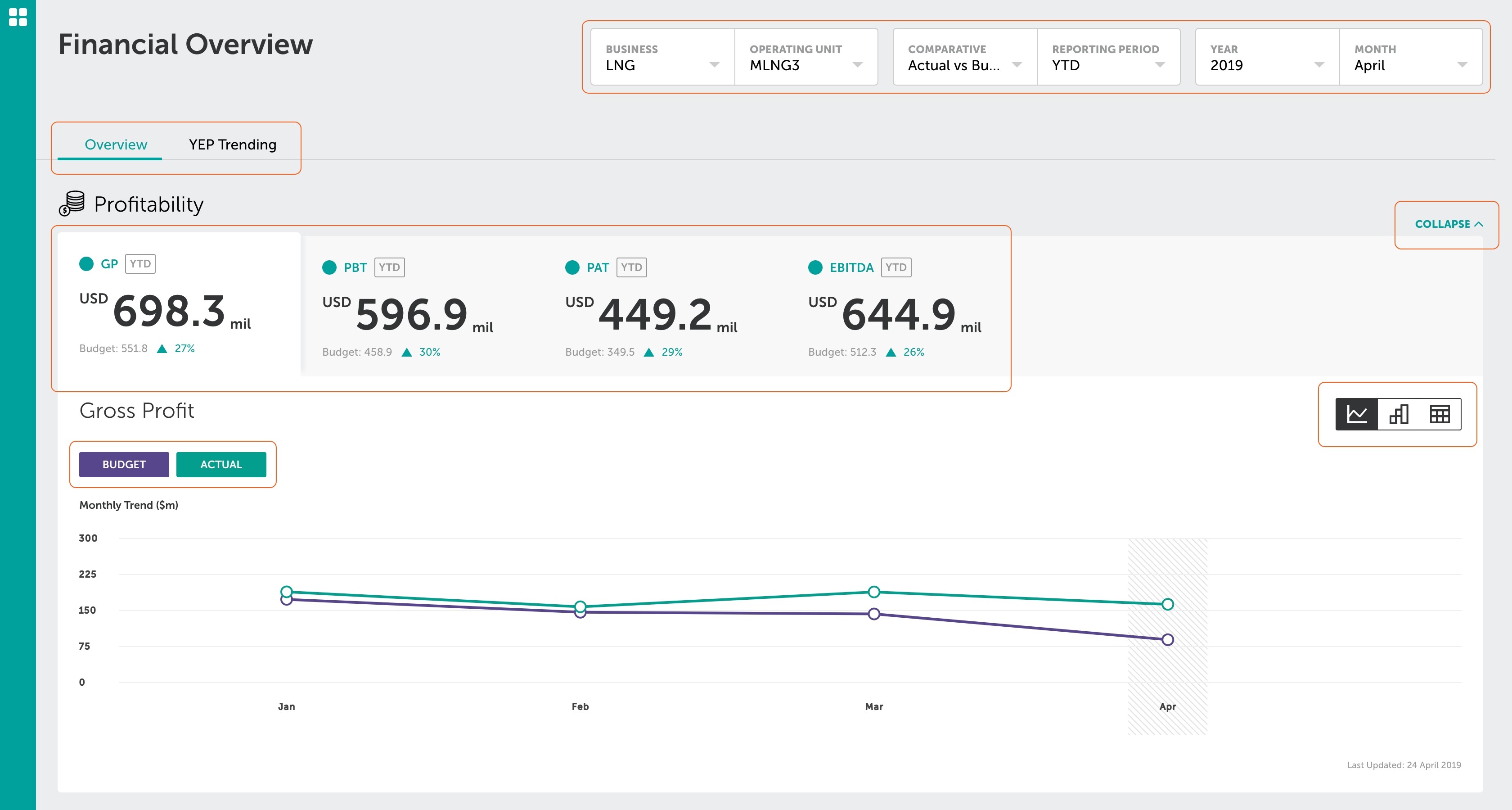
Simplify layout
The current layout lacks a clear information hierarchy, resulting in ambiguity about the intended sequence for reading the information.
As-is landing page

To-be landing page layout
[ Solution ]
Personalised navigation
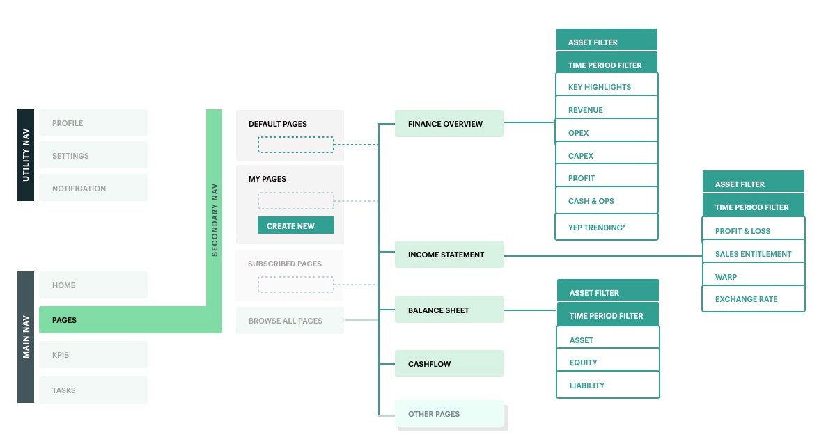
Navigation mapping
[ Solution ]
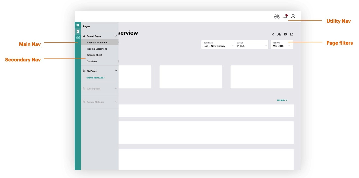
Standardised navigation and filtering system
[ Solution ]
Conduct usability testing to collect more insights
We invited main users to participate in usability testing and A/B trials, aiming to gather feedback and insights that will help validate overall functionality.
[ Solution ]
Synthesised usability results
[ Outcome ]
Handover
Multiple iterations and usability tests were conducted, leading to a successful handover of the design to the development team within the agreed-upon timeline.